Don’t make me think
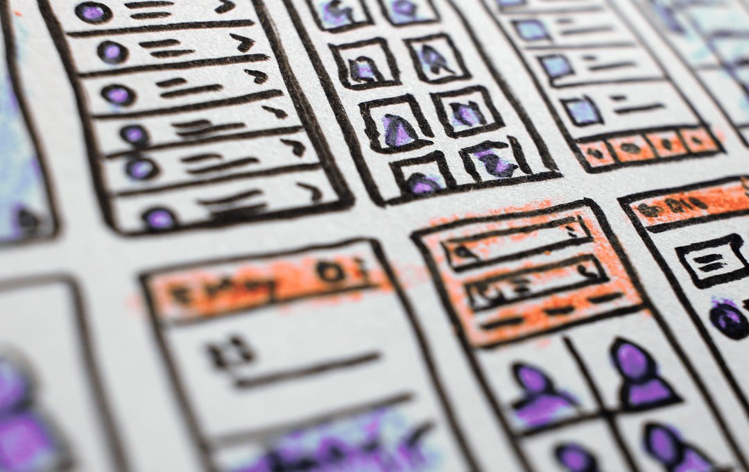
The primary purpose of websites is to provide a clear presentation and easy access to content of interest to a specific audience – whether it is a corporate website, Wikipedia, a search engine or an extensive hotel room reservation application. Although in each of these examples the mechanisms used should be tailored to the types of content and effectively respond to users’ expectations – it is impossible not to notice the similarity between different types of websites published on the Internet.
The solutions we currently encounter on websites are relatively well tested and safe – it is easy to predict their appearance and behavior on different devices, and users know how to use the objects visible on screen.

Thus, investing in innovative and original solutions is risky: it is easy to imagine a scenario in which potential clients get lost or do not understand the mechanisms used. Developing an innovative setting – if it is not just art for art’s sake – is time consuming and expensive. It is therefore wise and cost-effective to rely on proven solutions, with which the audience does not have to think too much.
In the tram, in the café, at the desk and on the refrigerator door
Responsive websites have settled in for good and apparently are not going anywhere. Ultimately, we are aiming at a situation in which the content published on the Internet will always be available, regardless of the equipment.
Responsiveness is no longer just a measure of the screen size of a phone, tablet or desktop computer, but rather a design philosophy based on accessibility.
In practice, this means that the content of a website should be easily accessible not only for the screen, but also for various types of content indexing and aggregating robots, screen readers (yes, blind people also use the Internet) and other applications that communicate with each other, using data without the whole layer of presentation that we humans perceive with our sense of sight.
The availability is gaining in value from year to year thanks to the spread of artificial intelligence and voice assistants, which are offered by Google, Apple and Amazon.
In Poland, the popularity of assistants is still low and for “Internet grandparents” (i.e. the 30+ generation) is not fully understood, but it is enough to look at the way in which even primary school students approach solving their homework in order to become aware of the direction and importance of the coming changes.
Clicking or pressing on the screen will be more and more passe and it won’t do you any good to design a website with the stunning slider, a parallax effect in the background or a cacophony of distracting animations.

The dynamically changing market of touch devices, smart and wearables also influences the standardization of websites and other UI/UX solutions. An interesting fact is that there are smartwatches, smart fridges and foldable smartphones with multiple screens. On all these devices – with non-standard screens and very different interfaces, as well as with different computing power – it should be possible to access website content.
Easy, easier, on your own
More and more web technologies boast friendly interfaces not only for end users, but also for administrators and editors who take care of the content.
Over the past years, both content management has become easier and the creation of more and more complex websites. The Internet is full of DIY website creators, and for more advanced users, hosting companies provide self-installers that install and perform basic configuration of popular content management systems such as WordPress, Joomla! etc. with a few clicks. From here, the owners get an extensive database of free themes and plugins that extend the functionality of systems installed by the hosting.

Visual editors built into content management systems are also becoming more powerful and easier to use. For example, starting from version 5.0, the most popular free CMS in the world – WordPress – has been given a modern Gutenberg editor, which works on the basis of block philosophy – very similar to the concept of components – known from modern programming libraries used to build complex web applications (e.g. React, Vue, Angular). Gutenberg, although in the current version it is only a content editor, is moving towards full page editing, including dynamic and repetitive content such as headers and footers – all without writing code.
However, ease of use has the advantage only when the number of available functions, switches, variables, in other words – everything the user sees in the panel – is minimized and the process is both repeatable and predictable for the user. Otherwise, it is difficult to talk about ease of use.
Making things easy to use promotes standardization and uniformity. Developers responsible for making DIY website builders realize that to be effective and competitive, their tool should offer the right flexibility – neither too much nor too little.
People are known to break everything in their creativity. So it is an amazing challenge to design a web editor that will reduce the probability of ruining professionally designed content layouts e.g. by placing too much content in areas not intended for this purpose.
Economy
Apparently, even the smallest business cannot exist today without a website. However, in the era of extensive and simple to use services such as Google Maps or Facebook pages, self-hosted small business websites make less and less sense.
However, on the web we will find plenty of offers for cheap websites, the total cost of which does not exceed two hundred dollars, bundled with the domain and hosting service. Although there are hidden traps in such offers, for which customers come to pay after a while (e.g. because they seem to take away domain and hosting duties from the customer, but in fact strip them of their property), many people decide to buy a cheap website.
Contractors, offering their services at favourable rates, cannot afford long hours of planning and design – instead, they use ready-made modules, themes and content templates, saving them time and allowing to sell cheaply.

Interestingly, on the other side of the Internet, dominated by huge websites, backed by IT mega-corporations, standardization driven by economics and accessibility to services is equally well placed. Although no one develops Facebook, Amazon or Google services using DIY content editors, which are responsible for building the Internet of small and medium enterprises, the economies of scale favour technologies such as React, which in turn are based, among other things, on easily reproducible components (components are like microprograms, which can be placed in different parts of an application or even used in different applications of the same manufacturer) designed on the basis of a predefined style and visual language. Hence, it is only a step away from unifying the look and feel of the entire application ecosystem.
Consequences
The aim of this text is not to make an assessment, but to try to break down the problem into several components, which can help to better understand why websites at the beginning of the second decade of the 21st century look the way they do. The problem is complex and difficult to synthesize in a few paragraphs, let alone to assess reliably.
Websites – both small and in the form of large and extensive sites – seem to shift the burden on ease of use and accessibility to content. The “Internet” has apparently matured to the point where visual effects do not offer much in return for the temporary delight of a narrow audience (or maybe we are just saturated enough with it).
Everything continues to accelerate – 5G is just around the corner and smartphones offering more than 10GB of memory are within reach of a growing number of consumers. At the same time, with newer and faster technologies available, the time we want to spend looking for and absorbing information is shortened. So it seems that the interfaces will be minimized and user choice will be less and less important – machine learning and Artificial Intelligence will be increasingly effective in telling us what we are looking for – without visiting, clicking, reading and browsing.
Perhaps the observed changes will lead us to a point of zero interface. When this happens – probably not soon (although, who knows).


