Prehistory
Designing websites has always involved having a lot of knowledge not only in the field of programming, but also in the graphics and usability of selected solutions. The situation was complicated by the fact that, in general, there were no rigid rules of conduct and that the Internet itself evolved at an increasing rate. The emergence of mobile devices with different resolutions and screen sizes has further complicated the situation. When publishing new websites on the web, designers invented and implemented their own interfaces, thus surpassing the originality of graphics, animation and website attractiveness. The level of complexity of the pages was constantly increasing. Multilevel menus, graphics in different formats, Flash, JavaScript animations, pop-up windows, and more or less different rendering of pages on different browsers made it increasingly challenging to reach content.
No wonder that the problems described above led the community of designers and programmers to standardize at least some of the solutions, which resulted in the emergence of mesh systems or even complex programming platforms. A solution that is constantly growing in popularity is the Twitter Bootstrap platform. In this article I will take a closer look at its architecture and advantages.
Framework – the backbone
The main advantage of using the programming platform in designing is the profit from having a stable, proven and tested foundation, which simplifies and significantly speeds up the process of site planning. The design of the model is limited to the block elements and the grid described in the platform. This gives us basic typographic styles, spaces between elements, and a coherent picture of the whole, thanks to the system of columns into which we can embed our content.
In the case of the Bootstrap framework, we have at our disposal 12 columns and the possibility of nesting the columns in the already existing ones, which can be of considerable importance when building complex applications or websites of a social character or online shops, where the logical formatting of the hierarchy is of huge importance for legibility.
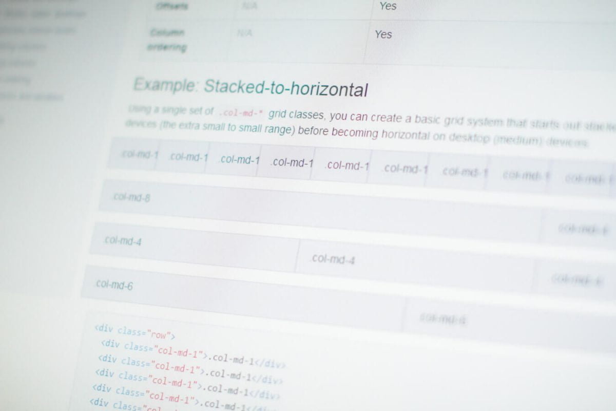
Flexible twelve column system with nesting capability
Menu on steroids
Due to the fact that the web pages are read from top to bottom, placing the main menu bar at the top seems obvious. Many pages (not necessarily based on Bootstrap platform) have become accustomed to this method, so it is not surprising that this framework has built-in solutions to quickly develop the main menu.
An interesting solution is also the possibility of easy “fastening” the navigation bar to the upper edge of the browser. In this way, it is still visible when scrolling through long pages. Naturally, such a solution is only active when the website is displayed on large screens. After loading the page on a small display, where every millimetre of gold is weighed, the entire contents of the menu are automatically stored under the navigation button and only spread out when you press it. The menu button is large enough to make it easy for users of smartphones and tablets to press.
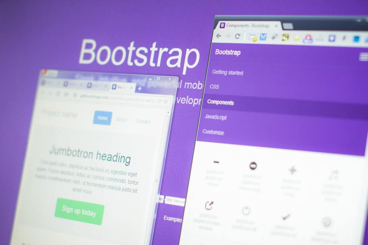
Bootstrap looks great regardless of screen size
Cornucopia
Column grid and navigation are only a small part of Bootstrap technology. The system offers a wealth of components, i.e. modules with specific functionality. They include modern font-based icons, drop-down menus, crusher navigation, various labels and features, progress bars, pagination systems, accordions, headers, text-covered areas, and much, much more. Wide range of available components allows to build a website with practically any functionality.
Of course, all this is based on examples together with standard graphics. However, there is nothing to stop you from adapting the system to your needs, while ensuring that all the elements work together.
Graphics from the code
Bootstrap is not only an attempt to collect and unify good practices in web design. Being a modern solution, it is susceptible to development and expansion, as well as leading trends. The emergence of HTML5/CSS3 technology initiated an era of simplifying the graphics of websites, e.g. by generating gradients from the browser, or by embedding fonts.
Attractive looking headers, forms, buttons and menus are no longer the result of small images designed in dedicated graphics applications (i.e. Photoshop or Fireworks). This is not necessary, as identical results can be achieved with less effort, taking into account in the code of the page the rules describing its appearance.
The latest version of Bootstrap takes full advantage of HTML5 and the LESS styling preprocessor. The combination of these technologies allows to “generate” a version of the platform, precisely adjusted to the requirements of the project. This saves a great deal of time, allows quick adjustments and ensures a consistent appearance.
How much for Bootstrap?
Bootstrap is available under Apache 2 license and without going into details it means that commercial use of this platform is possible free of charge. This may turn out to be very strange or even suspicious for people who are not related to the development environment. However, there is nothing to worry about – millions of websites are built on any version of this platform, and a detailed license with the magic “Download Bootstrap” button is available at project page.
Considering the free nature of the project and the fact that the responsibility for its updating and development lies with the creators, the use of this technology in the design of new websites is an excellent idea. It also means an investment in the form of easy development of the project and its adaptation to solutions that will appear in the future. With a bit of luck it may turn out that updating the website to the latest standards will be equivalent only to refreshing the Bootstrap platform.
Drawbacks of grid-based websites
After a few paragraphs of idealization, it is time to face up to the basic flaw of working with the framework. The most common charge directed at this solution is its relatively low flexibility in presenting the content. This is due to the fact that many of the pages designed on the basis of Bootstrap technology have an almost identical hierarchy, which can be described as follows:
- Menu
- Photography + Call to Action
- Text divided into sections/columns
- Popper
Although the calculation takes on different combinations (e.g. point 3 is repeated interlaced with photographs or testimonies), in a simplified way it should be admitted that the hierarchy of content between pages made with this technology remains very similar.
It should be remembered that Bootstrap under no circumstances imposes an obligation on designers to format the content exactly as they would like it to be. However, the presence of similar examples on the project website, and the way the frame has been developed, are elements that suggest the effectiveness of such a solution, which would explain its popularity among many designers.
However, I have the impression that the disadvantage described is only the result of some initial assumptions which allowed the system to be set up and which have been at the core of the system throughout the entire project and its development. Such assumptions are, above all, the desire to create a system accessible to users through the use of the best and simplest solutions. The result of such thinking is a set of specific formats and components, which due to their construction and popularity of the system itself, are repeated in the space of the Internet.
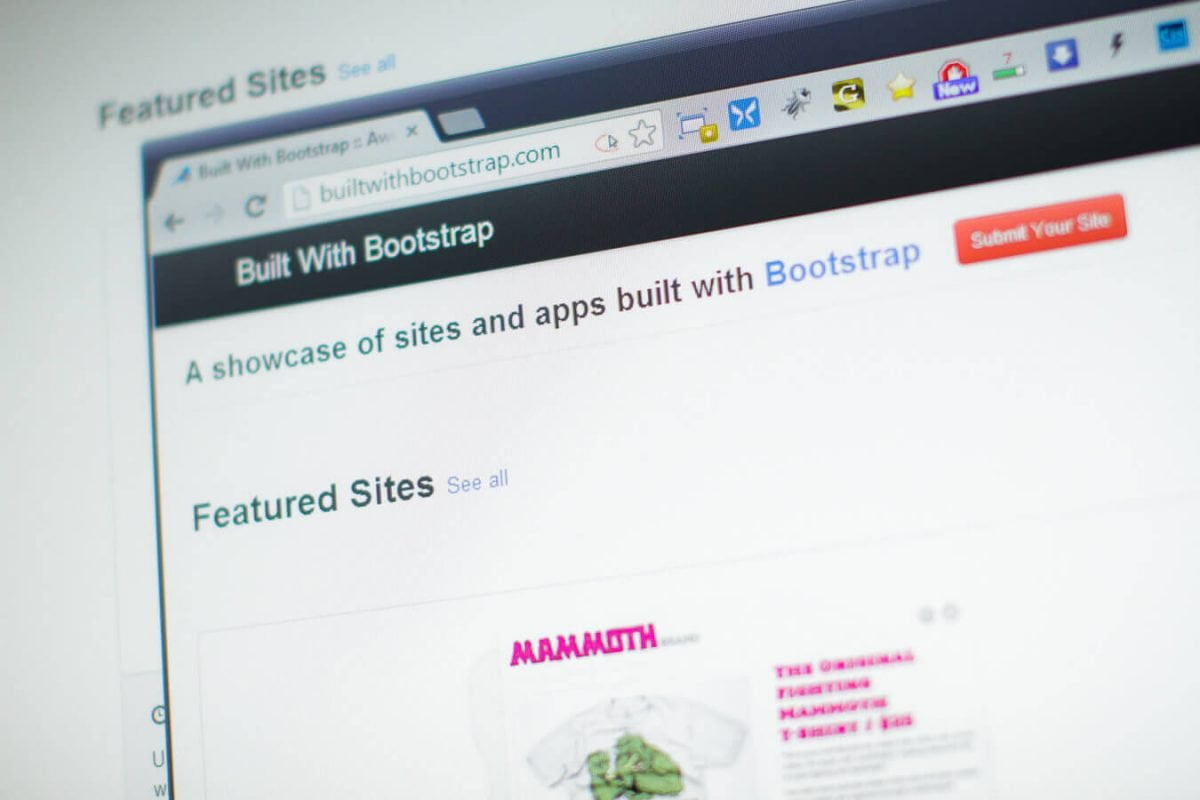
Pages designed with Twitter Bootstrap technology do not have to be boring. Even a special website builtwithbootstrap.com was created on which we can find a collection of interesting sites built on this framework.
Summary
Twitter Bootstrap is a brilliant tool that significantly simplifies and speeds up the process of designing websites and web applications. Flexible grid of twelve columns, and a multitude of ready-made elements powered by the original JavaScript engine allows you to build any functionality. The system is designed with the best possible accessibility of content in mind, and in its latest version marked with the number 3 it is built in accordance with the philosophy “Mobile First” offering not only a perfect look of the page on any device – it also provides better performance, which translates into faster loading of pages.
Framework is therefore a perfect solution for anyone who appreciates modern, perfectly designed websites, offering good accessibility to content regardless of browser and screen size.
Pros:
- Tested solution
- Works fine with all up to date browsers
- Consistent design
- Responsive Web Design
- High performance
- Easy to implement and configure
- 12 column grid system
- Integration of more than 20 different components
- LESS preprocessor support
- Available free of charge
Cons:
- Risk of theme duplication (repeatable layout)
- Ready-made solutions limited to the number of built-in modules
- Need for updating
Modern and attractive websites for your company
You’ve got the job done! I offer website designs tailored to your needs and budget. I work with the use of both modern technologies and solutions tested and proven by millions of Internet users. I will be happy to design your dream website.
