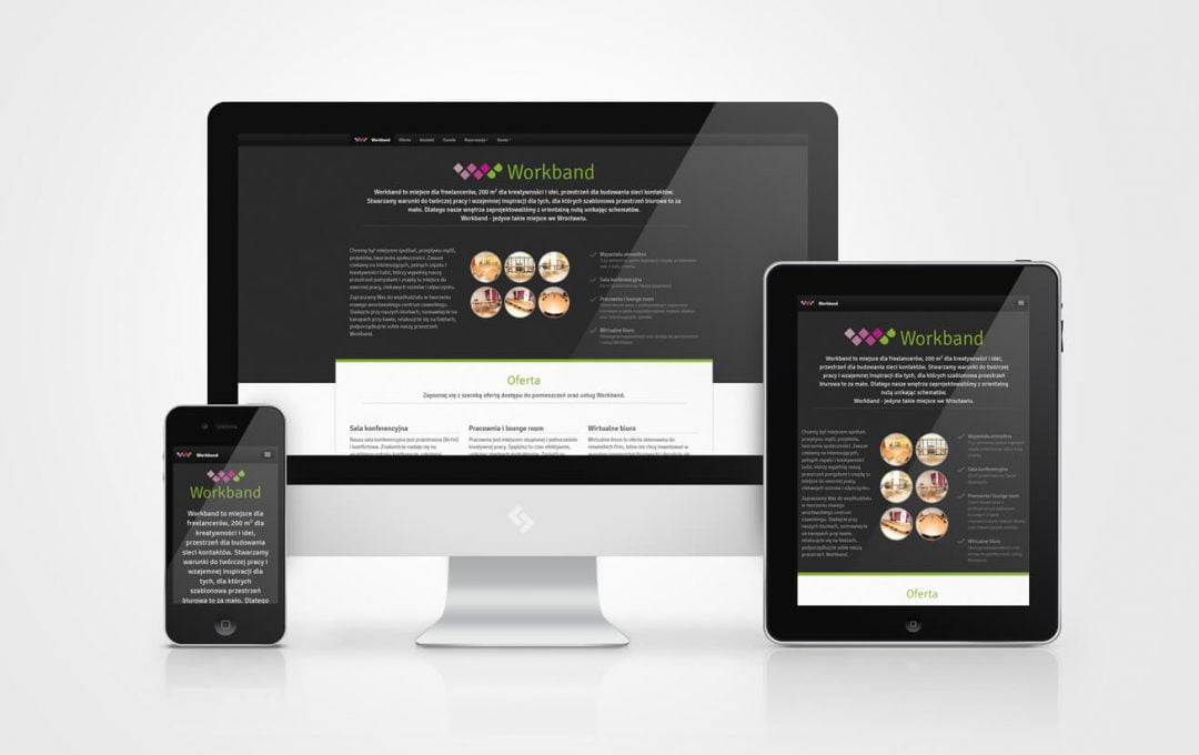
Internet in your pocket
For a long time now we have been observing a trend connected with the popularization of Internet access on mobile devices, which, moreover, are becoming more efficient and generally available day by day. Therefore, we no longer have to sit in front of the computer screen to get the information we are interested in. Just reach into your pocket on your smartphone to compare prices, check bus timetables, or simply kill boredom by browsing through funny pictures with your cat in the main role.
Unfortunately, this is not always easy. Until recently, websites were designed with a view to constantly growing screens that could easily display a large amount of text, images, links and other dynamic content at the same time. Navigations are designed for precise selection methods using the mouse and cursor. Although such a solution has been successful for years on the Internet presented on monitors, it turns out to be completely inconvenient when presented to the user on a device with a screen diagonal not exceeding a few inches.
Responsive Web Design to rescue
Responsive Web Design comes in handy. RWD is both a technique and a philosophy of designing web pages and applications so that, without duplicating the content, displaying them conveniently and legibly regardless of the device, its size and screen resolution installed. This is due to special declarations in CSS , which allow a web browser to format content in relation to the screen width calculated in pixels.
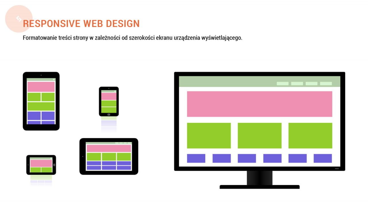
The illustration shows the “collapse” of multi-column systems into one unit on the example of different devices. With the help of CSS declarations, we can freely manage the presentation layer of the document without the need to modify the content. Therefore, there is only one version of the page – only the formatting method is changed.
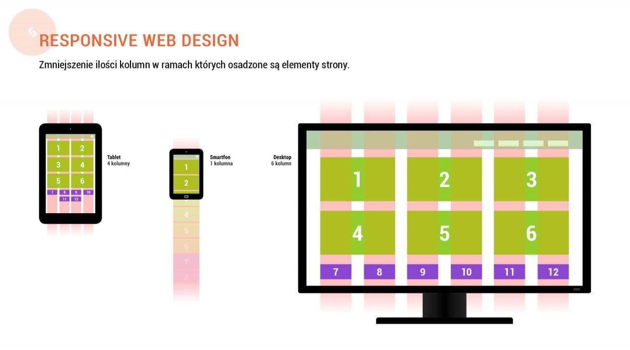
Three sample scenarios for content presentation with highlighted columns.
Responsible design
The technique I have described is also interesting in its socio-cultural context. An increasing number of designers and developers are characterized by an attitude, thanks to which they declare widespread availability of their projects. Responsive Web Design is therefore not only responsive design, but also responsible. Nothing is as frustrating as a product that does not meet the basic requirements – it does not reach its customers. I have the impression that responsibility is particularly important here, as it provides a solid basis for building a functional website. In information noise and a multitude of multimedia channels it is easy to get lost. It should come as no surprise, therefore, that users are more likely to choose content that is easier to read. Everyone benefits from a project whose foundations are based on accessibility. Designers feel satisfied with their excellent work, customers receive a service that is prone to a large number of visits, and customers quickly find the content they are interested in.
Do responsive websites cost a lot?
Not completely. The implementation of a system based on the RWD depends mainly on the complexity of the project and the features it must have. Creating separate style declarations for tablets and smartphones can therefore be a quick and relatively simple task, as well as requiring many hours of additional work and testing. Developing rules that allow for functional presentation of the content on screens of different sizes and density of pixels often means creating separate graphic designs. In principle, however, the GDR significantly increases costs only when designing websites with rare or highly developed functionality. In the case of relatively small company or product websites, costs can be significantly reduced by relying on popular open-licence technologies, i.e. CMS Joomla! or Framework Twitter Bootstrap.
Summary
Responsive Design ensures excellent accessibility of our website thanks to dynamic formatting of content taking into account screen size and resolution. Responsive design is therefore an excellent tool for removing the technological barriers that, until recently, discouraged Internet browsing on small displays of smartphones or tablets. The growing popularity of these devices makes it worth considering a website that will be created in accordance with the assumptions of technology and the philosophy of responsive design. It is an investment not only in modern technology, but also in the positive image of our organisation, which thanks to its flexible design proves that it respects its partners by presenting them with content tailored to their preferences.
Ask for a quote for designing modern, responsive website
I offer my clients solutions based on content management systems and templates built in accordance with the Responsive Web Design technique. Depending on the assumed budget and functionality of the service, I am able to design the site completely from scratch, or expand and customize the commercial product to meet the assumptions presented by the customer.
