Printed standards
Although digital text has been with us for a long time, both on websites and on displays of various types of mobile devices, e-book readers or objects operating in the domain of the Internet of Things, our habits with regard to the desired appearance of text rather come from printed sources.
This is a liquid state. A generation that is currently born may have different patterns (because it interacts with digital text from an early age), but for adults, when I write this text, the legibility standard is printed on paper.
It’s worth remembering – I believe that it’s crucial to understand where the myth of universal full text justification came from, which effectively makes it difficult to read both small and amateur websites, as well as large news portals.
Alignment or justification of the text
The column of text can be aligned in four ways:
- flush left,
- centered,
- flush right,
- making both edges the same (full justify).
Alignment to the left edge (flush left)
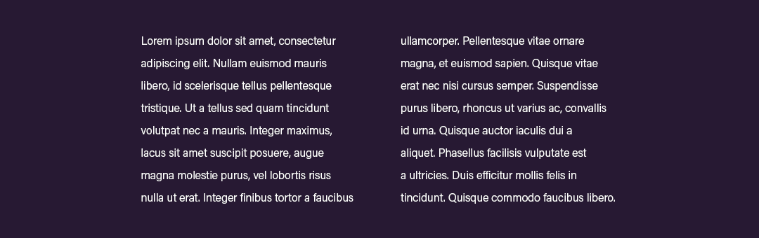
Please note the distinction in the paragraph above: “The same spacing must be maintained between the two words”. This is very important and will be useful later in the text.
Centered
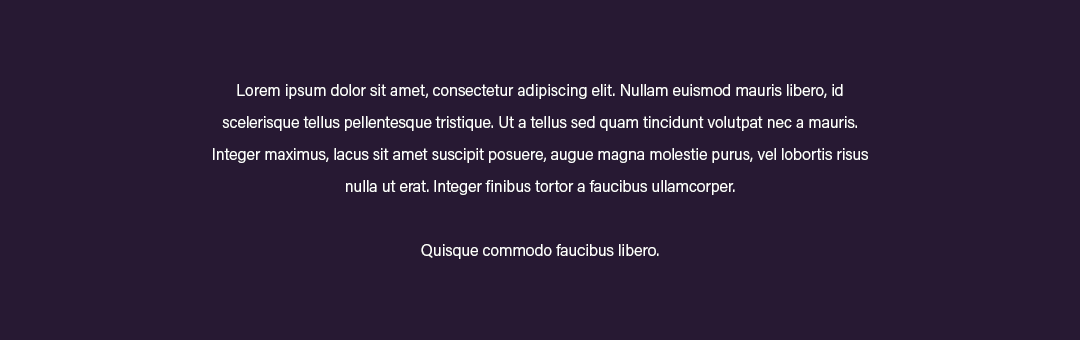
When is this format an option? Central formatting is useful for items that need to attract attention or for simple graphic forms where text is scarce. An interesting example is an intricate vertical business card project where all the data are centrally aligned. Pictures in social media can also have a signature or a call to action placed centrally. It is worth remembering, however, that such a text should not be placed with other important objects, with which it will have to compete for attention.
In central formatting, moderation is important – the less text is used, the better the effect.
Alignment to the right edge (flush right)
We should definitely not use the right-edge alignment for the main text (works) for languages read from left to right. For legibility, this is similar to central alignment – because the left edge of the column is uneven, the eyes have to do a lot of hard work – they cannot move freely and unhindered through the block of text.
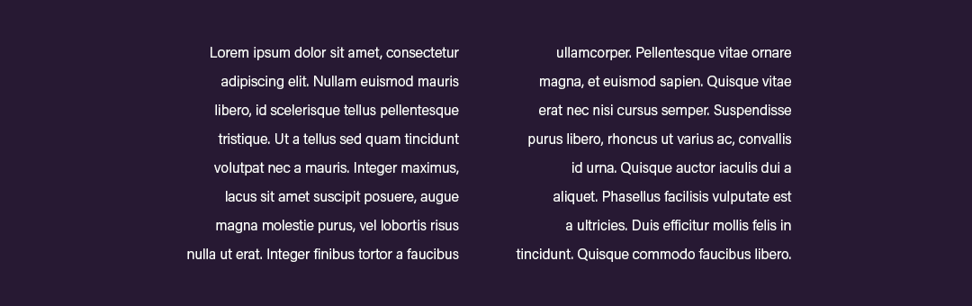
Full justify
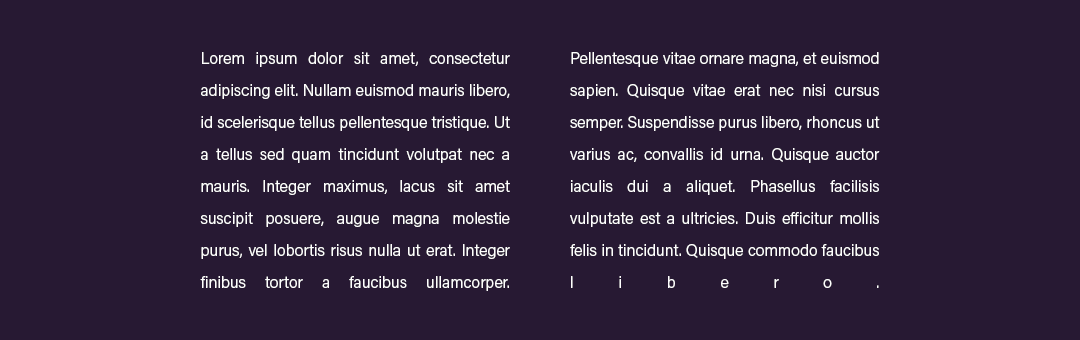
Example of full text justification in a web browser. The need to align both edges of the text results in a clearly distorted inter-verbal light and leads to a bizarre adjustment of the single word in the last line. Such a text not only looks bad, but is also unpleasant to read.
There is only one minor problem: If we force even edges for the text, something needs to be stretched out. Since letter spacing is critical for legibility, word spacing is usually stretched. Typically, because professional printed text compositing software can handle this challenge quite well, introducing various techniques to optimize word spacing, such as:
- Advanced dictionaries with full control of word breakage and word handling (if gaps are too variable and noticeable at first glance, more aggressive word splitting can be used);
- Algorithms that adjust whole paragraphs instead of each individual line (e-book readers do not have enough computing power to make this process invisible to the user and would also cause considerable delays in drawing text on mobile computers);
- Possibility of slightly reducing or increasing (2 – 3%) the interletter spacing (unnoticeable to the reader) in order to obtain more uniform and satisfactory word spacing.
Internet browsers, e-book readers and IoT devices (car displays, washing machines and refrigerators, smart watches and other wearables) cannot do this. Perhaps they will learn it one day and text editors such as Microsoft Word and Google Docs will gain advanced compositing features known from DTP applications. Unfortunately, as far as I am concerned, this is not the near future.
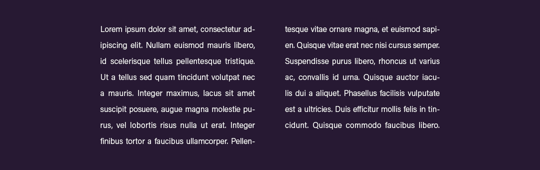
Example of text adjustment performed by Adobe InDesign – professional application for text composition. The galleys prepared in this way are legible and look good. Unfortunately, in practice such formatting of text on websites is impossible – It’s impossible!
The reading process
A skilful reader reads by jumping along the lines of text. These short movements, called saccades, are separated by fixation intervals, during which the eyes stop for 0.2-0.4 seconds. Many saccades examine the line of text, and then one large saccade returns to the left to the beginning of the next line. The information is received only at the moment of fixation. With an average size of writing used in printed books, the saccade consists of 5-10 letters, i.e. one or two words in Polish. It can also start or end within a word. During the resting break, only 3-4 of those letters at most are sharply seen, which are within the area of fixation, while the others are perceived by the eye unclearly and only in connection with others. If the meaning of the text is not clear, the eyes jump backwards in the regressive saccades and “make sure that they have read the text”.
— Jost Hochuli, Detal w typografii, wydawnictwo d2d.pl, Kraków 2009, s. 8
If we want to share information, why make the process more difficult?
Excessive interletter or word spacing disturbs the rhythm. Because the intervals are fluid and unpredictable, your eyes need to do more to read the text. As a result, understanding the content is more difficult and time-consuming.
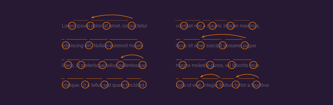
Circles indicate fixation points where the eye rests longer and sees more clearly. Straight lines between circles indicate progressive (progressive) saccades and curves indicate regressive (reversible) saccades.
If you can’t get used to e-books and you don’t know exactly why, try switching text formatting to flush left, increase the line height and the font size – your eyes will appreciate it.
Readable text on the Internet, how to do it?
There are various sophisticated methods of formatting text on the Internet, many of which are inspired by good printing practices. However, you do not need to be a professional typographer to make it easier for readers to read the text. A few simple rules are enough:
1. Large letters and clearly legible line height
The 12-pixel text is long gone. Instead of the default resolution of 1024 × 768 pixels, we reach 1920 × 1080, and thanks to mobile technologies, we achieve a screen density of 400 points per inch, which is higher than the standards for printed publications.
Currently, it is believed that the absolute minimum for the base text of websites is 16 pixels, although in many cases it is not worth to descend below 18 pixels.
Reading text from the screen is usually less comfortable than reading paper. It is useful to provide the readers with enough breathing space between the lines to facilitate the reading process.
For example, the text on my blog is 18/32 pixels (size / line height), and the Jacek Kłosiński’s blog (a well-known Polish blogger dealing with the subjects of creative industry) core values are as much as 21/34.
At the same time, remember that such a large amount of text may not look great on mobile devices. It is worth developing a separate style for mobile devices, checking the readability of the text in practice.
2. Margins between paragraphs
Section notches used in printing do not work on the Internet. It is better to have a space between the paragraphs with a height of at least one line. Combined with optimal text size and line height, this will improve overall readability and allow audiences to better understand where they are in the article.
3. Flush left text align
Complete justification of the text can be achieved by DTP operators who have complex text composition software in their arsenals and years of experience and knowledge. If you create digital text that is displayed on the Internet or use text editors, use flush left coposition.
This will avoid uneven spacing between words, bizarre situations in narrow columns with words scattered over edges, and automatically make the text predictable to the eyes regardless of the number of words in a line.
Remember that the right edge of the text is not important for legibility — the eyesight leaves it as smoothly as they do, regardless of whether it is equal or not.
4. Line width
One line of the main text should contain from 9 to 11 words. This amount allows for smooth reading without the eye needing to bounce from one edge of the screen to another. There is no reason why you should tell your readers to shake their heads when they read the content on your website.
Remember that these practices apply to columns and blocks of text. This does not mean that the entire website cannot have full screen elements. Simply put, the main text should be limited in width. I solved this problem by closing blog content in a separate container, narrower than the overall width of the site. This way, the text is in the middle of the screen and can be read without turning your head.
5. Highlights in text
You may have a very unique group of readers who enthusiastically read the texts from beginning to end, but unfortunately the statistics are inexorable and indicate one thing – we do not read the texts on the websites, instead we scan them. If you want to convey a key idea in a paragraph or a section consisting of several paragraphs – highlight the key fragment in the text . This will give readers the opportunity to “grasp” the important part by reading a bold sentence in the process of scanning the content of a page.
Remember, however, that a distinction of 50% of the text is not a distinction. If you need to distinguish such a large part, consider whether the remaining 50% is needed at all. It is a good idea to guide readers to important content, but random distinctions are not necessary.
It is also extremely valuable to include appropriate headings in the paragraphs. You can treat it as a greeting or a summary of the content that follows. It is also common to write headlines in the form of questions, so that you can easily find interesting issues while scrolling through the site.
6. Contrast
Instead of black text on white background, think about dark grey text on light grey background. The paper, compared to LCD screens, does not shine – it has a smaller, more “natural” contrast for us. Experiment with different levels of grey – initially you can choose 90% grey for text and 5% grey for background. Different values may give a better or worse effect depending on the layout of the page and the choice of typefaces.
Unfortunately, few people care about proper screen calibration, and the default phone settings leave much to be desired when it comes to eye protection, instead tempting with bright colors. You can reduce this effect by reducing the overall contrast of the text on your page.
7. Bullet points
If you can write something in the form of a bullet list, do so. Unlike one long text, the dots are finite and usually contain a lot of valuable information in a small space. It is quite likely that with the contents of the list you will encourage your readers to read the rest of the text.
Summary
We live in a constant information noise. We use various techniques that allow us to select relevant information from hundreds of messages that reach us every day. We search for information by choosing from other information. Competition is fierce.
It is a good idea to prepare the text in such a way as to make it legible. You may think it’s an exaggeration, but for a potential reader it’s a challenge to get to your materials by yourself. You have to reach for the phone, tap the search engine query, slide your finger around the screen, read, process, think. It’s a lot of work, considering that everyone does a lot of similar things during the day.
The boundary between: “Yes, I’ve found what I’m looking for, I’m going to find it all out right away”, and “it’s impossible to read it, I’ll look somewhere else” is very thin.
